
PowerPal

As part of my interactive design courses at Tulane SOPA, I created PowerPal, a website and application aimed at helping renters and homeowners monitor and understand their energy usage.
THE PROBLEM?
Energy bills continue to rise, yet many renters and homeowners and renters don’t understand what is driving the increase. Most energy monitoring tools show raw data without context, leaving users to guess instead of make informed decisions.
THE SOLUTION?
To create a smart, easy-to-use dashboard that demystifies energy use for homeowners and renters so that they can cut costs, save money, and be more eco-friendly.
EMPATHIZE
User Flow
I began by identifying the core user needs:
Reduce energy bills
Understand cost drivers
Lower carbon footprint
As well as identifying the target audience:
Homeowners
Renters
Research Goals
I want to understand what users prefer and the difficulties they experience with tracking their energy usage throughout the month. I will specifically focus on what users need to keep themselves motivated and aware of their energy usage throughout the month, not just when their bill arrives.
Participants
I tested five users that are either renting or homeowners between the ages of 21-45 via Zoom, with one in person. Each session lasted an average of 15-30 minutes and were done in each design sprint.
User Journey Mapping
I mapped the typical energy experience:
Bill arrives
User reacts to high cost
Attempts temporary reduction
Forgets to continue new energy saving habits until next bill arrives
Competitor Research
I analyzed existing energy monitoring platforms, including Loop, to understand how they:
Present consumption data
Understand what already works + what doesn't
Motivate continued engagement
Reinforce habit-building
This helped identify gaps in clarity, personalization, and behavioral motivation.

DEFINE
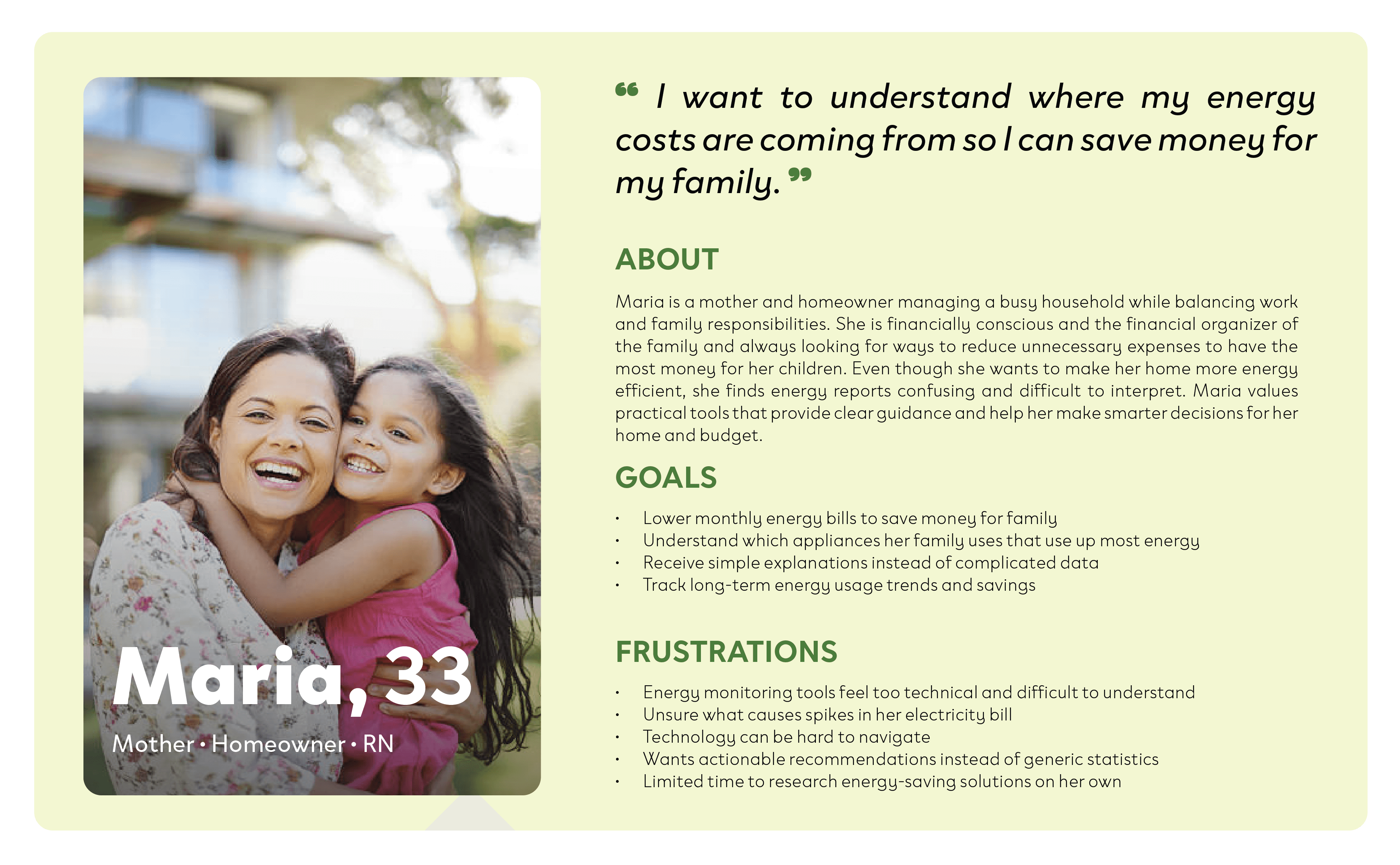
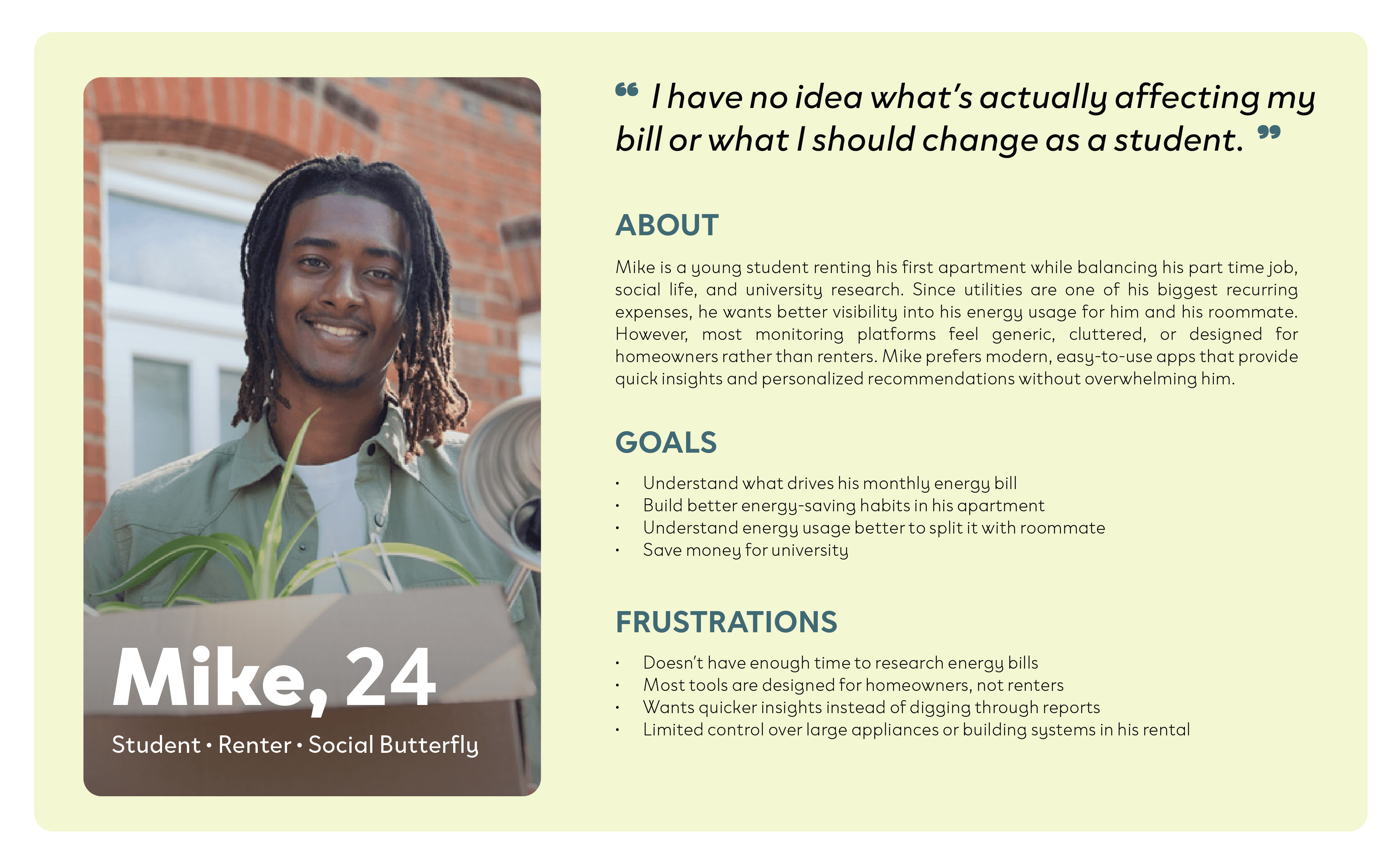
User Personas
By creating a user persona, I can better understand the actual users’ needs, goals, and pain points. This allows me to provide more meaningful user experiences based on the user personas.
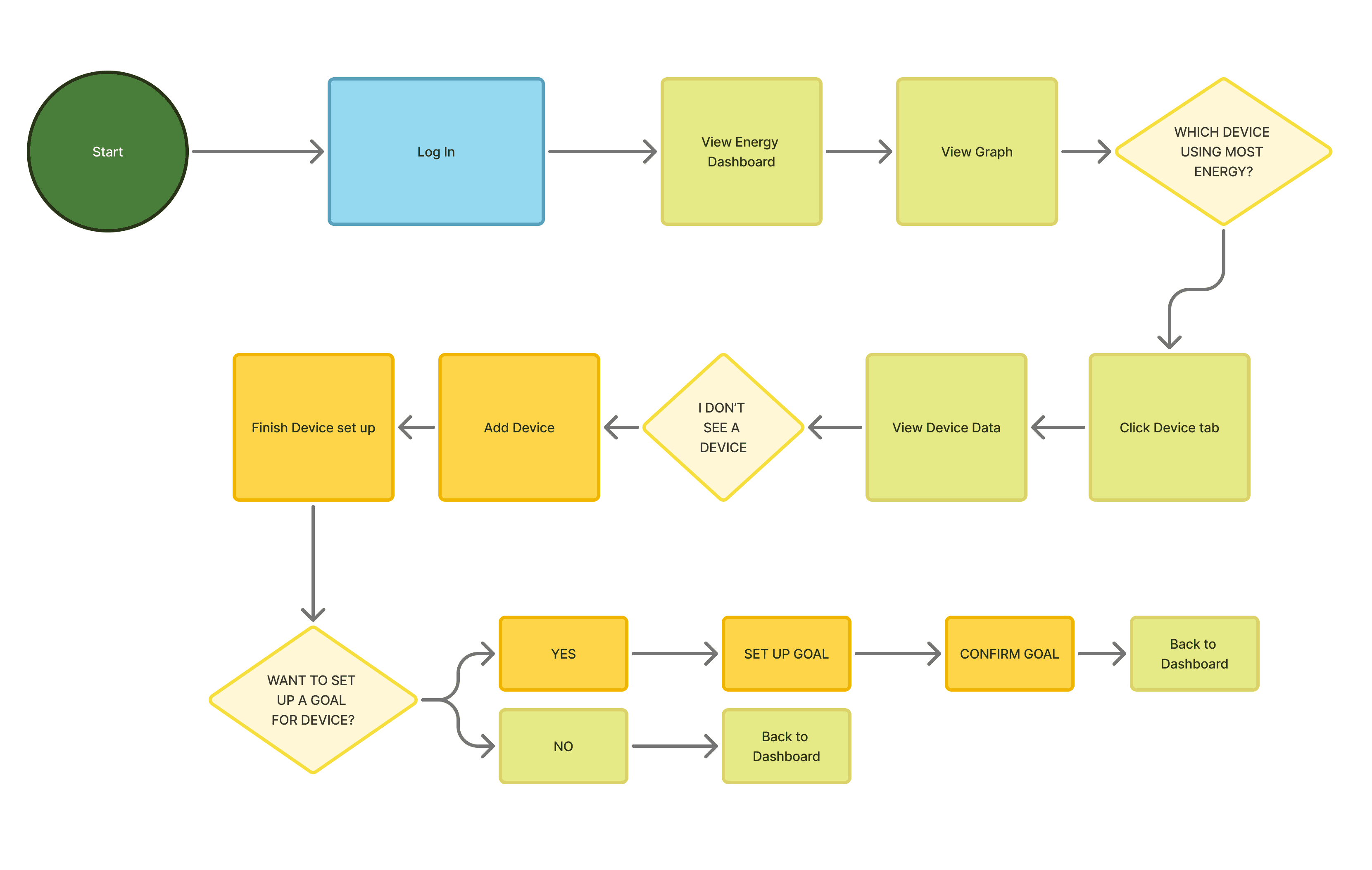
User Flows
Creating this user flow helped show the user journey and their potential decisions when going through two tasks: viewing their dashboard to see their energy consumption, and creating an energy goal for the month.
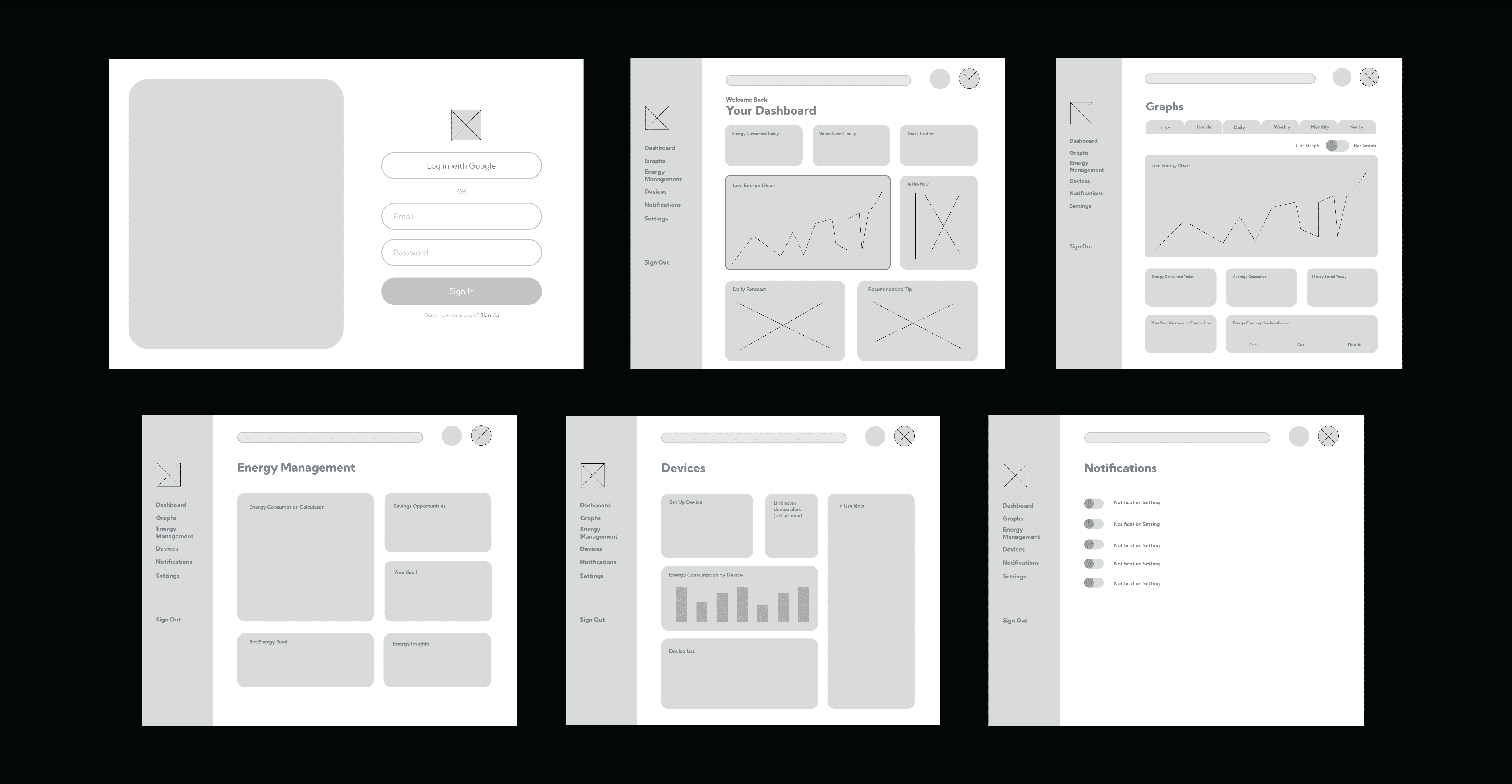
Low-Fidelity Wireframes
I structured the app around:
Dashboard
Graphs
Devices
Energy Education
Energy Management (Goals)
Focused on:
Clear hierarchy
Multiple data visualizations (bar, line, bubble)
Device breakdown
Goal-setting feature
Testing & Affinity Mapping
I conducted user tests with:
4 participants
Renters (20s)
Homeowners (30s)
~15-minute sessions over Zoom
This helped to understand the functionality of the wireframe.
Key Findings
50% of users struggled to find “Energy Consumed Today” outside the dashboard.
50% showed little interest in energy education and preferred specific usage details instead.
Users preferred bar charts for quick comparisons rather than lines.
A correlation emerged between interest in Goal Tracking and higher frequent app use.
Three users recommended friendlier, more vibrant colors.
Affinity mapping helped cluster issues around:
Discoverability
Label clarity
Visualization hierarchy
Motivation
Personalization
PROTOTYPE
Introducing Gamification: PowerPal
To increase engagement frequency, I introduced PowerPal, a gamified feature that transforms energy-saving into a rewarding experience.
Concept
A PowerPal turns energy saving into a rewarding journey. By completing personal goals or daily challenges, users earn Eco Points. With Eco Points, they can grow a virtual garden, forest, or energy-efficient city, while saving money and reducing their environmental impact in real life.
Core Mechanic
Goals became the primary way to earn points
Daily challenges encouraged consistent check-ins
Visual growth of the user's PowerPal garden reinforced positive behavior
Testing PowerPal
To test users and better know what the goal function could include, users were asked:
What do you think PowerPal is for?
How would you view your current goal?
How would you set a new goal?
How would you customize your PowerPal world?
What energy-saving goals would you set?
Findings
Users clearly understood that PowerPal was tied to progress
Goals were the strongest motivator
The virtual growth system increased emotional investment
Gamification successfully addressed the low mid-month engagement issue.
Branding
PowerPal's brand identity was designed to make energy management feel approachable, rewarding, and positive. Instead of presenting energy consumption as a technical or overwhelming, the visual system uses friendly design elements, vibrant colors, and clear and rounded typography to create an experience that feels encouraging. The branding supports the app's goal of helping users build sustainable habits while making energy tracking feel accessible.
Brand Attributes
Friendly
Motivational
Sustainable
Welcoming
Optimistic
Educational without feeling overwhelming
By working around these brand attributes, the logo was created with rounded shapes and a playful visual of a "smiling" cable plug reinforce the idea that energy management doesn't have to feel complicated or intimidating.
Color Palette
The color palette draws inspiration from nature and sustainability while incorporating energetic accent colors to support the app's gamified experience.
Greens: Growth, sustainability, and nature
Blue: Clear skies, calm, and trust
Yellow: Electricity, optimism, and sunshine
Orange: Motivation, energy, and action
Brown: Earthiness, balance, and eco friendly
Typography Goals
Maintain clarity across data visualizations and dashboards
Create a friendly, approachable user experience
Establish a clear hierarchy for complex information

TEST
In the final sprint, I tested the high fidelity prototype.
Users were asked to:
Check live energy consumption
Identify appliances currently in use
Check energy usage by room
Add a device
View and edit goals
Access PowerPal
Their response to the branding
Results
Navigation labels were significantly clearer
Live consumption was easier to locate
Goal creation was intuitive
PowerPal added perceived motivation
Visual hierarchy improved data readability
Branding felt friendly and reflected the energy saving theme
Final Outcome
Sign In & Dashboard
Graphs
Devices
PowerPal & Goal Setting
The redesigned energy monitor transforms passive bill-checking into an engaging, goal-driven system.
Instead of reacting once a month, users are encouraged to:
Track daily usage
Identify cost drivers
Set meaningful goals
Earn rewards
Build long-term energy-saving habits
By combining smart data visualization with behavioral motivation, the app empowers users to reduce costs and their carbon footprint consistently, not just at the end of the month, ensuring that users are always up to date with their energy spending and remain conscious of the environment!