PetMinder

Petminder is a group project aimed at creating an all-in-one solution for pet parents to get reminders for medication, vet visits, exercise, and more all tailored for their specific pet's needs.
The team for this project included Anneliese De Pano, Andrew Rumore, and Dayana Vasquez-Gonzalez (me!). We all contributed to the testing, brand design, and prototyping.
I specifically worked on the calendar, reminders, and pet analysis and recommendations.
As a team, our design process included: empathizing with the problem, defining the problem and solutions, ideating, prototyping, and testing, all while going back and creating new ideas and prototypes based on testing results.

EMPATHIZE
COMPETITIVE ANALYSIS
The project began research on existing pet care tracking apps and identifying user needs. We conducted a competitive analysis of three other pet care tracking apps, noting their strengths, weaknesses, opportunities and threats.

USER TESTING
Each of us conducted separate testing sessions with low-fidelity wireframes that presented the potential layout of the app.
The testing consisted of one-on-one Zoom interviews, focus group interviews, and one-on-one in-person interviews. We tested 13 users total, with an even range of cat and dog owners. They all fit our target audience of working adults (20s-40s).

KEY FINDINGS
With user testing, we wanted to gauge what kind of needs users need met with our app as well as their current pet care habits that the app could help with.
Many participants take their pets to the vet every six months to a year
More frequent vet visits for puppies, or if pet has special conditions or is sick
Some users would want recommendations, but they would view them at their own will.
One user said they would mostly use it if their pet was sick.
Don't want push notifications for them.
Two users suggested they would like notifications for feeding times.
A few users said they wouldn’t use the app if they were “bombarded” with ads.
Solution: We would allow notifications to be adjustable and we will have no ads.
DEFINE
USER PERSONA
Luis is a busy professor who struggles keeping up with
Giving Buddy his flea treatments.
Update Buddy’s vaccines.
Buy the right food for Buddy’s size/breed.
Luis has tried other pet health tracking apps, but they’re too generic or not user-friendly.
Pet owners like Luis don’t have a personalized way to help them track and take care of their pet’s health.
How does the PetMinder app solve this?
How might we provide users with a streamlined and personalized pet care routine or regimen that saves them time on doing their own reserach?
How might we add personalization and recommendations to a pet health tracker app?
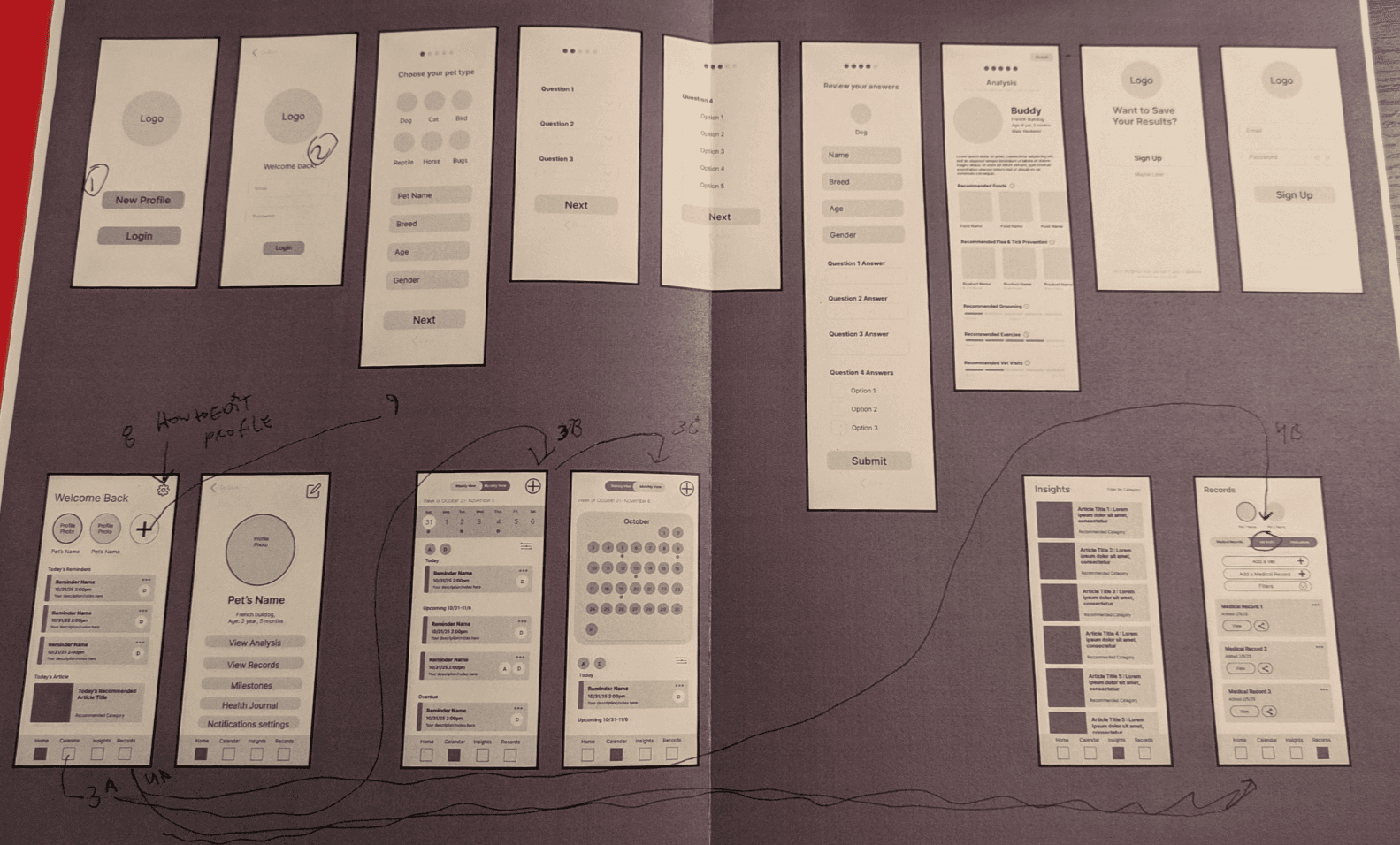
PROTOTYPE
MID-FIDELITY WIREFRAMES PT. 2

We set up our prototype with a main page explaining the directions, and asked our users to explore the app.
We then asked them to participate in a survey on Google Forms. This helped us to adjust any possible navigation issues, potential pain points, and add anything else they may need.
Questions we also posed ourselves with this round of testing were:
How might we add notifications without overwhelming the user?
How might we incorporate notification and reminder sharing for users that share pets within a household?
KEY FINDINGS
100% of users knew how to add a new pet profile.
100% of users knew how to view an existing pet’s profile.
Most users knew where to find recommendations and tips but had different ways of finding it.
Some users responded by saying recommendations are on the home profile.
Some users responded by saying recommendations are in the analysis page after taking the onboarding quiz.
Some users responded by saying it’s in the education tab.
93% of users found how to edit notification settings
85% of users found how to edit a pet’s profile
83.3% of users preferred overdue reminders to be displayed at the top of their home page
PROTOTYPES
After gaining more insight from the testing, I added the new "share pet" feature and tested the prototypes. Everyone on the team contributed a little to every wireframe and piece of the prototype, but here are some of the main ones I worked on:
TEST
Branding
PetMinder’s brand identity was designed to balance approachability with trustworthiness so that it is reliable for pet owners. The visual system centers around a blue and green color palette, combining the cleanliness, professionalism, and dependability associated with blue with the health, wellness, and growth represented by green. Therefore it is friendly, but also takes your pet's health seriously by having clean color palette and typography.
Accessibility and usability were key considerations throughout the branding process. Clean typography, clear information hierarchy, and high-contrast interface elements were chosen to ensure readability for users. This helps pet parents quickly access important information such as medications, appointments, health records, and personalized recommendations.

Final Prototype
With our final round of testing, we found that users responded well to the branding we created as a team.
Users were also able to get through the sign up, setting up appointments, creating new vet appointments, and access their pet's information, records, and even add a new pet successfully.
Wireframes